Violet is wonderful!
The mere ambiguity in the secret it releases is indescribable. Violet teases my being in a very positive way that’s why I like to have it close to me. It’s at the same time distressing, unbridled, calm and dreamy.
Violet is the synonym of secret, magic, power and exaltation. And what’s most important – violet is rebellious and independent!
However in Christian tradition this colour symbolizes penance.
In the history of humanity violet
has often been treated “interchangeably” with black as a colour of mourning. This phenomenon has been especially seen where black has been rejected due to its too negative connotations or as equivalent of extraordinary events ( for example veils of widows getting married again were violet, not black ).
Exceptional prestige among colours gained crimson – connection of red with violet.
Since antiquity crimson dye, made of little Mediterranean snail secretion has been highly esteemed. Kings and magnates wore crimson robes probably because the dye was extremely expensive and the colour could rarely be found in nature.
„To put on crimson” meant to become a king or a cardinal. For this reason until now this colour symbolizes authority, splendour, divinity. Combining crimson and gold we mean luxury, power and wealth. And adding violet to gold – victory, triumph and rising.
In a European painting the colour violet has been rarely used so its role was marginal. Such situation was probably caused by lack of access to dye of proper quality. The only one known since the Middle Ages, very short-lasting and natural violet dye, was folium, the juice from plants. However it did not have adequate distinctness. Violet in the past has been obtained mainly from mixture of cool red with blue. But “non-existence” of violet took place also in Sixth and XX th century when the era of chemically produced paints came which is quite an ordinary phenomenon.
From contemporary known artists only 2 great colourists often used violet as a colour which is beautiful, intensive and pure: Pierre Bonnard and Henri Matisse. And for this I hold them in high esteem.
Now this colour is much more appreciated and liberated, which pleases the eye and mind :)
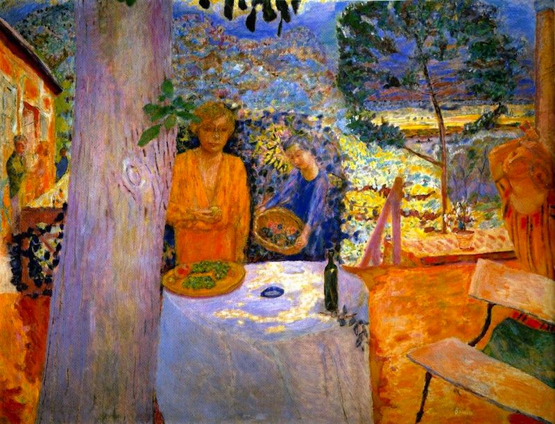
Pierre Bonnard – The terrace at Vernonnet
Virtuosity of colours and sounds with addition of warm and cool violet.
